Explore the design strategy behind a nutrition-focused YouTube thumbnail centred on L-Glutamine. This case study shows how visuals were used to counter supplement myths and engage science-minded viewers through bold, evidence-based messaging.
Project Context
This YouTube thumbnail was created for an educational video aimed at debunking myths around L-Glutamine. L-Glutamine is a popular amino acid supplement often discussed in sports nutrition and bodybuilding contexts.
The thumbnail is not part of any brand promotion. It is a visual tool designed to spark curiosity and build credibility. The aim is to attract viewers who value science-backed content.
Design Objectives
The primary goal was to create a visually striking and topic-relevant thumbnail that would:
- Instantly communicate the subject matter (L-Glutamine and muscle performance)
- Spark curiosity with a bold question format
- Attract viewers interested in fitness, supplements, or sports nutrition
Visual Strategy
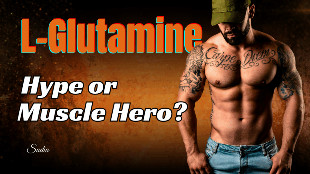
1. Powerful Headline Typography
The phrase “L-Glutamine” uses a large, bright orange-red font with a teal shadow — this dual-contrast styling makes the title pop against the textured background. It ensures visibility even on mobile screens or in dark YouTube interfaces.
The teal also complements subtle blue tones in the imagery, creating visual harmony without distraction.
The subheading “Hype or Muscle Hero?” is written in a bold, black-and-white font. The question format immediately invites inquiry and challenges assumptions, effectively setting up the theme of science vs. fitness trends.
2. Use of Character Imagery
A well-built male figure with visible tattoos and a commanding posture is positioned on the right. This instantly signals a fitness-related theme. The cap covering his eyes adds mystery and intensity, drawing the viewer’s attention toward the core message rather than facial expressions.
Importantly, the image represents the target viewer persona: someone who works out, follows supplement trends, and seeks performance-enhancing information — yet wants to separate hype from facts
3. Colour and Background Composition
The burnt orange and dark brown gradient background has a textured, almost “molten” effect that gives the thumbnail a gritty, powerful feel. This colour scheme reflects intensity and raw strength — visually echoing themes common in bodybuilding, fitness, and sports nutrition content.
The contrast between warm and dark tones ensures both text and subject stand out sharply, which is crucial for click-through optimisation.
4. Layout Balance and Signature Branding
The visual weight is balanced: the left side features bold text, while the right side is anchored by the muscular figure. The creator’s name “Sadia” is subtly included, supporting visual branding without disrupting composition.
Outcome and Value
This thumbnail is engineered for high visual impact and topic clarity, allowing it to:
- Grab attention quickly in a crowded nutrition/fitness/health feed
- Clearly communicate that the video is not promotional, but evidence-based
- Appeal to both casual fitness enthusiasts and science-focused viewers
It reflects how visuals can educate and engage without resorting to gimmicky imagery or misleading symbols (like generic supplement bottles).
Why This Matters to Health and Fitness Brands
For health educators, supplement reviewers, and fitness channels, trust-building starts with presentation. A thumbnail like this:
- Signals professionalism and depth
- Differentiates science-backed content from influencer hype
- Supports higher viewer retention and CTR due to accurate, bold framing
It shows that even without product placements or exaggerated effects, smart design can make educational content compelling.
Disclaimer
All YouTube thumbnail designs on this page are original creations made solely for portfolio and demonstration purposes. Some designs may include fictional titles, AI-generated or altered imagery, and references to public figures or popular content themes. These thumbnails are not affiliated with, endorsed by, or connected to any real individuals, brands, or YouTube channels.
All designs are copyright © 2022–2025 writingbysadia.com. All rights reserved.