This case study unpacks the visual thinking behind a spicy mutton curry YouTube thumbnail — designed to tempt tastebuds, grab attention, and bring handcrafted flavour to the feed using smart layout, bold type, and rich colour contrast.
Project Context
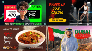
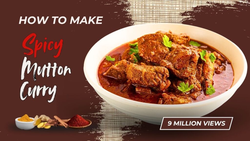
This mock thumbnail was crafted for a conceptual YouTube cooking video titled “How to Make Spicey Mutton Curry”. The video concept is simple: a home-cooked, rich, flavourful Indian dish. But the challenge?
Making a still image attention-worthy enough to compete with fast-paced food content and saturated cooking thumbnails.
There’s no brand or sponsorship behind this. The goal was purely design-focused, to create a visual that feels deliciously bold, sparks interest, and makes someone go, “Whoa, I want to eat that!” before even clicking play.
Design Objectives
The thumbnail was designed to:
- Immediately signal that this is a spicy, hearty, home-cooked mutton curry
- Appeal to food lovers, home cooks, and spice enthusiasts
- Use visual warmth and boldness to evoke flavour and richness
- Stand out in YouTube’s crowded recipe category with strong contrast and punchy layout
Visual Strategy
1. Bold, Playful Typography That’s Still Legible
The word “Spicey” is intentionally styled with a handwritten, red brushstroke font. It’s hot, loud, and slightly exaggerated to echo the boldness of chilli and masalas.
The rest of the title (“Mutton Curry”) uses a textured, slightly rustic white font, keeping the vibe informal, homely, and approachable.
The contrast in font styles adds flavour (pun intended), but more importantly, it helps break visual monotony. This mix helps communicate that this isn’t some generic recipe, it’s vibrant, real, and possibly packed with heat.
2. Hero Shot That Looks Good Enough to Eat
The dish itself is the star. The image of the mutton curry is placed front and centre with a rich, red gravy glistening under natural light. The white bowl contrasts against the deep brown-red background, letting the colours of the curry pop without filters or over-editing.
Garnished with coriander wasn’t just a culinary detail-visually, it adds a splash of green that helps break the reds and adds a sense of freshness.
3. Warm, Earthy Colour Palette with Textural Play
The background uses a deep brown-maroon gradient that feels earthy and grounded, much like the dish itself. Subtle brushstroke textures on the right help blend the photo and backdrop while also adding a rustic, handcrafted vibe.
On the left, a spice plate featuring turmeric, ginger, cinnamon, and chilli powder sets the culinary tone without overwhelming the layout. It’s a soft anchor that reinforces the recipe’s cultural and flavour depth.
4. Visual Hierarchy and Layout Balance
The left side is dominated by the headline and spice plate, while the right side is anchored by the curry bowl, giving the thumbnail a natural Z-shaped flow. The text leads the eye into the image, and the image leads it right back to the “9 million views” tag (a playful and mock) stat that adds realism without claiming actual performance.
The creator’s name “Sadia” sits subtly in the corner, integrated into the visual story without becoming a distraction.
Outcome and Value
This project acts as a creative proof-of-concept for how well-crafted food thumbnails can:
- Make viewers “taste” the recipe before watching
- Stand out with visual warmth and handcrafted design details
- Avoid the sterile, overly polished look common in mass-produced cooking content
- Highlight ingredients without crowding the layout
Why This Matters for Food Creators, Culinary Brands, and Beyond
In the fast-scroll world of YouTube, especially in food content, flavour alone won’t cut it – visual storytelling is what gets the click. A thumbnail like this can help:
- Reflect the soul of home cooking while staying modern and clickable
- Build authenticity without relying on clickbait or exaggerated visuals
- Appeal to both hobbyist cooks and serious food content audiences
- Enhance viewer trust and curiosity with well-balanced, flavourful design
Who can benefit from this kind of design approach?
- YouTube food creators looking to break through the noise with high-impact visuals
- Spice brands aiming to showcase products through engaging recipe content
- Cooking class platforms needing attention-worthy imagery to market their lessons
- Food bloggers shifting to long-form video and needing strong brand presentation
- Cultural cuisine educators who want to honour tradition while catching attention
Whether you’re sharing comfort food or launching a digital recipe course, the thumbnail is your first impression. And it should taste as good as the dish itself.
Disclaimer
All YouTube thumbnail designs on this page are original creations made solely for portfolio and demonstration purposes. Some designs may include fictional titles, AI-generated or altered imagery, and references to public figures or popular content themes. These thumbnails are not affiliated with, endorsed by, or connected to any real individuals, brands, or YouTube channels.
All designs are copyright © 2022–2025 writingbysadia.com. All rights reserved.